How to Make Your Film Look Cinematic with Film Design
“If you want more interesting footage, choose more interesting things.”
Cinematic films feel like they have a patina over every element in the image that unifies film’s overall aesthetic. This patina is different for each film based on the needs of story. Sometimes it’s a specific color palette, other times it’s a textural quality or even a specific use of composition.
How do you create this patina of cinematic cohesion with our films? It’s by crafting your own Visual Storytelling Language, what I call this cinematic patina or overall cohesion. Your Visual Storytelling Language is how you choose to speak through the images you create. Every element of filmmaking utilizes 5 tenets of design to tell the story. These 5 tenets are: Color, line/form, texture, scale/space, and movement. Then, through juxtaposition and composition of these elements, you build relationships and meaning that sets the context for your story.
The relationship you create visually through the 5 tenets work character to character, world to world, character to world, world to universe, sequence to sequence and even shot to shot, creating meanings and subconscious understandings for your audiences.
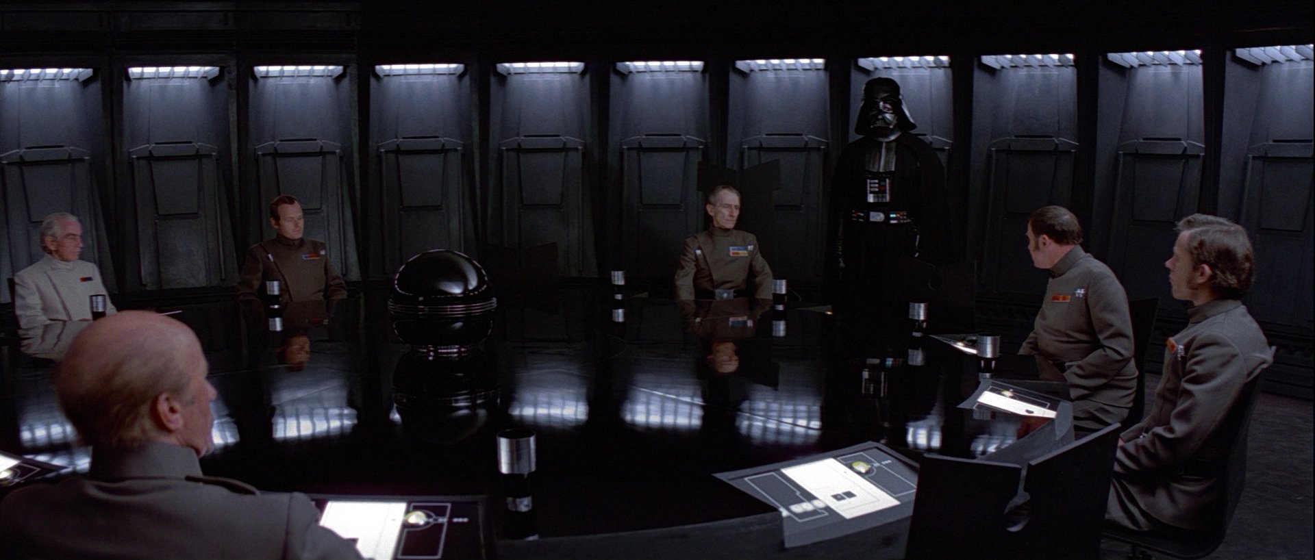
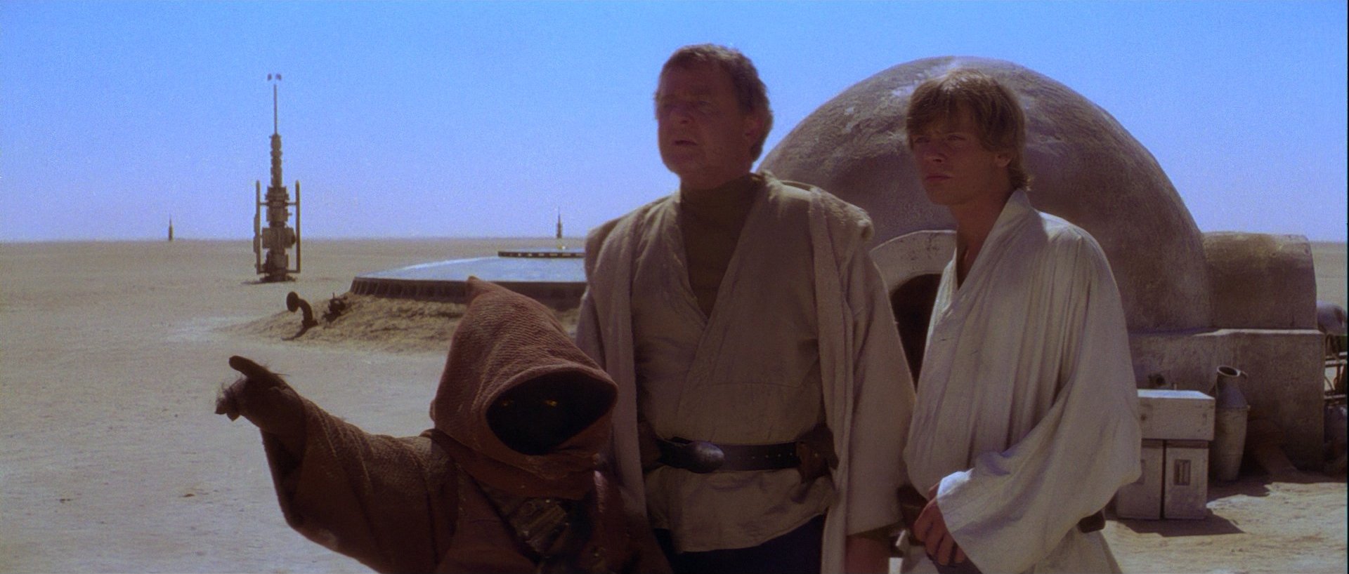
Let’s look at an example in storytelling: the protagonist of the film is one about a person verses the world around them—such as Star Wars: A New Hope (1977). The Empire and its worlds of oppression are more rigid in line/form quality. Lines and shapes tend to be angular, have hard edges, and are precise. While Luke’s world has more organic lines. There’s a sense of fluidity, softness and movement to the lines created by the draped fabrics.
The conflict and tension between the two worlds is immediately established in their line qualities along, then further supported by the other tenets like texture, color, and movement. The Empire is rigid, immoveable; Luke’s World is fluid or soft. By pitting the line quality of each world against one another, the the conflict between the two worlds and ideals is clearly created.
By curating clear worlds that form intentional relationships between one another, like in the example above, you create your own cinematic feeling and experience for the audience and form your unique Visual Storytelling Language.
Finding your own Visual Storytelling Language:
To find your own style or the approach that fits the story you are telling, you get to know where you’re going with your story visually and be able to articulate it to your collaborators. To start, you want to understand how the 5 different tenets of design each contribute to the overall visual of your film and how to craft meaning through juxtaposition and composition with them. This understanding of how they work together as a whole will help you set up the context of your story (To get a full rundown on the psychology of these elements, check out my workshops The 5 Tenet of Design or Text to Moving Images).
Once you have this understanding, you’re begin the visual research process of gathering images. Look anywhere and everywhere for inspiration. Let this portion of your visual research process be about discovery—what can you find that you didn’t know you were looking for, but that surpasses your expectations and delights you? Gathering all the images that speak to you regardless of knowing why—that is unimportant at this phase. Look at the images devoid of judgement, letting them just be. This moment is solely about collecting and your curiosity.
After you’ve gathered 200 or more images, take a day to let them breath. Sometimes we can look at images with preconceived notions of what it is, blinding us to what is actually going on which is why this breathing time is so important. This allows your mind to settle and come back to the images with fresh eyes. What do you see when you look at the images? What’s actually there verses what you think is there? What themes arise in the images? What similarities are there? What’s different? What in the images is surprising you?
Start looking at images and films, asking your self: What is going on here? What are the different subtle, visual cues I’m being given and how are they making me feel? Make sure to press beyond your both your comfort zone and the obvious. What relationships have been created through color? Through Texture? Through line/form? Through movement? Through Scale? How are the creatives creating relationships with juxtaposition and composition?
As you look through the images you’ve gathered you’re going to start culling them. What images align? Group them together. What images don’t seem to fit? Take them way. This part of the process might be the most important and one of the reasons visual research requires finding so many images. It is the culling or editing process where your visual language comes to light. As you start categorizing your images together, you being to craft a cohesion of inspiration and visual influence. How you sort and categorize your images doesn’t matter as long as it serves your creative process. It could be through mood, color, texture, composition, location, character, etc.
Once you’ve done your initial sorting, try putting things into a collage to see the world you’re creating and how the images relate to one another. What do you see now that you’ve culled everything? How are you using color? Line/form? Texture? Movement? Scale and space? Composition? The answers to these questions are your visual storytelling language and how you achieve your own cinematic aesthetic. This processes can be repeated until all the holes in your story are answered.
The clearer you become on your Visual Storytelling Language, the more cohesive your film will feel and the better your department heads will be able to craft the film you’ve been envisioning.
Take your films to the next level and learn the insights all the masters know.
Join Text to Moving Images where you’ll learn how to use film design as a storytelling tool, articulate your creative vision, and ultimately make wildly cinematic films.


